A discussion of the Genesis of the Queen Beatrix Postage Stamp in the infant days of Computer Technology 1983-1984, resulting in an icon that has been a design mainstay in The Netherlands for over 20 years.
See also an introducion of the subject of Mathematics & Art by Kees Kaldenbach.
Photo by VPRO television
 H.
Producing a Queen's Postage Stamp in the Netherlands basically is a
simple assignment, bringing together three elements being the
portrait of the Head of State, the value indication and the word
"Nederland". Did this assignment form a challenge to create something
quite different than had been produced up to that point? What did it
mean to you to portray the Head of State on a postage
stamp?
H.
Producing a Queen's Postage Stamp in the Netherlands basically is a
simple assignment, bringing together three elements being the
portrait of the Head of State, the value indication and the word
"Nederland". Did this assignment form a challenge to create something
quite different than had been produced up to that point? What did it
mean to you to portray the Head of State on a postage
stamp?
S. Including the portrait of the Head of State on a postage Stamp turns it into a document of value; for me it is just conventional. It is traditional. Creating this postage stamp was a challenge because in my work I am interested in abstract structures, not in representations which do root in visual reality. I had to strive for a combination of an abstract structure and a representational one. In my personal statement on the stamp (see later on) I have clearly explained what this meant to me.
H. Did you take into consideration how one generally thinks of the Head of State?
S. Yes, the Queen of the Netherlands will be one of the few people within the Netherlands about whom everyone has an opinion. This makes her unique. I do not think there is a second person - maybe it would be her Queen mother - so many people would have an opinion of. This makes her extraordinary. There are hardly any persons or any matters on which so many persons have an opinion. This makes it precious. And it is irrelevant whether the opinion be positive of negative, emotionally, affective, historically, politically or socially motivated. The point is that there are such vast numbers of meanings present. This also applies to art. The more meanings are projected by a work of art, the more important it becomes. If a work of art does not generate opinions, it hardly exists. The more opinions it generates and the more these are varied and nuanced, the more proof is given of its importance.
Fine arts is also about an artist giving their opinion about reality, and this generates opinions. The more these are structured and variegated the heavier the weight of the opinion which is embedded within the work of art and thus the meaning of the work of art. If an art work does not yield response it is meaningless.
H. But doesn't it depend on what reactions they are and who voices them. Isn't it about the contents of the meaning?
S. It is not about simple and single responses, but about responses which in turn inspire a discussion and thus yield structure. The contents of these responses is unimportant to me, it is the structure itself that counts. A response consisting of "yes" or "no" is structureless and therefore senseless. It is all about quality, nuance, diversity of discussion. Thise yield meaning to the art work or artist.
H. Dit you also intend to express the significance of the Head of State in your postage stamp?
S. No, the absolotely unique aspects of the Kingship, its extraordinary quality is something far removed from my work. In my work I do not address reality or current affairs, but I do appreciate this uniqueness as a cultural fact. In my own work I address structure, complexity, change and these qualities I will connect for once to this absolutely unique and un-abstract.
H. You are creating an image with a structure of dots?
S. Distances between ponts, relative distances represent a minimal fact which do not carry meaning within itself. It is unpretentious material, but one may do a lot with it as we have seen. The meaningful portrait is built of the most meaningless of elements. Finding this combination within this postage stamp was my motive. When first presenting it I made the following statement: "As designer of the Queen's postage stamp I deal with two important matters. The portrait of the Queen and the design of the postage stamp. The portrait yields the image of Queen Beatrix and with it the multitude of values regarding the person and the Head of State which are present within the Dutch population. It is a meaningful image. In designing the postage stamp and its portrait section in particular I use the least associative and least meaningful elements I know of - the space between dots. Generally visual images can be conjured by either densely grouping or thinning out of dots. The dots themselves do not refer to an outside reality. As a designer I am fascinated by the similarity of some of the dots with Beatrix, thus generating a specific meaning."
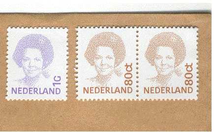
[The Queen's postage stamp has been issued in various values, of 60 cants, 75 cents, 80 cents, 1 guilder etc. The portrait section remains identical but the background colour and the indicated value are different. KK]
H. Another aspect are the colours of the value range. Did you choose specific colours?
S. I strive towards a light background colour, and superimposed the portrait is printed in a dark colour. In the entire series there are 16 colours and it seemed correct to pick these from the entire spectrum. This yields a better coherence between colours than shown thus far in the permanent postage stamp series. You will find randomly chosen colours and sometimes colours which resemble each other, but they have not shown coherence. I find it strange that so little attention has been given to that in the past unless other arguments were valid which I do not know of. There is relatively little colour coherence in the series of numbered postage stamps. [This refers to a series of postage stamps showing only numbers and some scrolled calligraphy lines. KK]
H. Those colours were chosen because of their readability, clarity, and distinguishing characteristics - not because of any structural quality.
S. They did not ask themselves 'How can I formalise this specific aspect (colour) in order to generate the utmost diversity and utmost coherence'. I deal with the latter and I am fascinated by that. I generate a certain system while striving for a wide palette of colours. The point is to enter an optimal discernment within that narrow band which is defined by an optical balance of the dark but transparant head, the background colour and the white letters and numbers which are areas left blank within that background. Whichever single colours turn out the best in the end is not important to me. I have no preference for individual colours but I do value their relationship.
See steps in the design phase with various trial portraits.
Description by art historian Paul Hefting of the
Struycken has digitalized the portrait of the Head of State and translated it into a field of dots which are spaced individually, unlike the placement in a grid which is normally used by a printer. The special thing about the procedure is that the photogravure could be used without the classical grid, yielding a constant quality. The structure of ponts is one of the many possibillities which all would yield a similar image. This sounds mysteriously but when one knows something about the procedure yielding this structure it becomes less of a mystery.
Struycken contacted the engineers Ir. F.C.A. Groen and Ir. P.W. Verbeek of the Department of Pattern Recognition of the Delft Polytechnic University asking them how a portrait could be translated into dots, without showing the ubiquitous grid in a patterned on horizontal and vertical lines. The portrait should consist of as little dots possible, but without impeding recognition. The image thus created by this objective method will yield a cetrain vagueness and distinction befitting a permanent postage stamp which is a value paper in its own right. This process of production would also yield a formality and a timelessness. By this method the all too anecdotic character of a portrait photo is transformed into a more general image which befits our image of a Head of State.
By digitalizing two problems had to be solved: a) where to place a dot and where to place none and b) the position of these dots within the total surface. The first question was tackled at the Pattern Recognition Department by applying a pattern recognition software programme which was engineered by Ir. Smeulders. Broadly it worked this way. A square surface is divided into a grid of 128 cells wide and 128 cells wide, totaling 16384 cells. Within these cells black dots are placed in such a way as to make an image (in this case a portrait) recognizable. In order to define the placement one has defined a scale of grey values, running from white to black. These values have been identified by numbers, being 0 (white) running to 255 (black). The portrait photograph of Queen Beatrix was scanned for all grey values between white and black. These values were added and if it totalled above 255 a black dot is entered. One starts with the first line from left to right. If for instance the first cell has a grey value of 40, the second 100 (totalling 140) and the third 120 (totalling 260) a black dot is put in the third cell and the rest value (5) is transfered to the next cell. The fourth cell has a value of 100 (totalling 105), the fifth cell 80 (totalling 185), the sixth cell 100 (totalling 285); thus another black dot is put in that cell and the rest value (30) is transfered. In this way line by line is scanned in meander fashion. In the end the collection of black dots represent the image which has been scanned.
But another step has to be taken for the dots are still in a clearly recognizable square grid. The idea was to end up with a seemingly random pattern of dots which was evenly but irregularly spread across the surface. Thus the grid of dots was altered. One could imagine a flat box with 16384 round marbles being shaken lightly so that the marbles would shift a little bit out of their alignment, yielding a somewhat disturbed pattern. If this is repeated the pattern will become increasingly irregular. In order to execute this controlled shaking a system was devised. Just outside each dot there was its circular territory. Now the dots are moved one by one. A dice induced system of chance defines what direction the dot will move. There are however two governing rules. The dot was not allowed beyond 3 moves up or down or left or right. And it should never touch the territory of its neighbor. If that should happen the dot stays put. When all 16384 dots have been moved in individual directions (the entire field once over) a shift is noticeable but when this action is repeated 20 times the pattern has been radically altered.
Those dots which at first were properly aligned are now shifted about in a seemingly random way. The grid has disappeared, or rather it has become invisible. Thisprocedure could be applied for many applications and the Pattern Recognition Department of the Delft Polytechnical University is active in many branches of science such as medical diagnostics, recognizing chromosome structures, categorizing structures in echocardiography, monitoring engineeringfrom industrial production methods to quality control. Digitizing a portrait turning it into a permanent Queen Beatrix's postage stamp series, is a rather unusual application for this Department. Still it has its practical use as it would be well nigh impossible to counterfeit this stamp. One would need to know the computer system and the series of 20 iterations in order to duplicate the stamp.
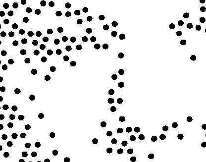
A detail of the postage stamp, showing Queen Beatrix's eyes and nose.
The dot manipulation program created in Delft was not only run in a grid of 128 cells but also in grids of 80, 90 and 100 cells per line. The outcome of calculations was transferred to the Dr. Neher-laboratory of the Dutch Postal services, in which a calculation plotting table drew the final output. This last printing phase of the work was in the hands of mr. A.G. Monayhan, BSC. The printed result was transferred to the official printer of all Dutch curency and value papers, the firm Joh. Enschedé & Zonen in Haarlem. They produced a series of initial proofs and also a proof series of 12 different stamps in varied colours and values. This required much experimentation and communication as it comprised an entirely new printing procedure.
Art historian Paul Hefting writes:
At my request the Dutch typography designer Gerard Unger wrote the following explanation in his typography for the new Queen Beatrix Postage Stamps.
Unger: "In the first part of the Twentieth Century rotogravure (also called photogravure) became available for industrial printing technique, including the mass production of postage stamps. In normal photogravure which was used for postage stamps but also for magazine production, the grid densities varied between 40 to 100 points per cm. All of these points are of an identical size and are equidistant. Differences in printed tone occur by varying the depth of these points. Shallow points bring about a thin layer of ink on the paper and deep points result in dense layer of ink. Photogravure has always been a beautiful technique for reproducing art and especially photography translates very well into this printing technique.
Normally in applying photogravure one does not take the image into consideration. To my knowlegde - and I did do research - it was the first time that letters and numbers were purpously left blank within the rotogravure grid. Normally the grid is blanketed over the text and the letters and numbers are turned into an arbitrary grid structrure which does rather damage the letters. Amongst typographers it is a rule of thumb that small letter types (8, 9, 10 points) should not be printed in slender letter types as strong letter types fare much better. In normal photogravure the points of the grid are applied in lines which are in right angles to each other and which are positioned on a 45 degrees angle. If one would maintain a strictly horizontal/vertical position it would crop up through the printed image. By rotating the grid this optical illusion is eliminated. In the Queen Beatrix Postage Stamps the 183 lines each of 199 points have been somewhat shifted, resulting in lines which meet in a 30 degree angle on the vertical lines of the points. In printing the postage stamps vertically and printing the letters and numbers vertically this serrates the vertical parts of those letters and numbers. When positioned horizontally a corresponding effect is generated. Initially a finer grid was to be used but this created difficulties in the printing process. In order to group a number of (negative) postage stamps on the rotogravure cylinder this stamp is photographically duplicated and the fine grid could not handle this treatment. The grid now used represents the state of the art at the firm Joh. Enschedé & Zonen.
The grid point size has been chosen in such a way that it allows for flowing of the ink results in a smooth surface. The character of the typography was chosaen by Peter Struycken. It was my task to find solutions concerning the grid of points. In placing the word NEDERLAND it was my job to give the letters their proper boldness in relationship to the total size of the letters. I also had to proportion the letters and take care of the kerning also taking into account the inner spaces of each letter and position the word over the total width of the postage stamp. This sounds like a circus act. The numbers has a problem of their own as they were complicated in shape and full of curves. Using the fine grid this was aleady a problem, but when the larger grid replaced it, the circus act became even more complicated."
See steps in the design phase with various trial portraits.
Links to Struycken on internet:
http://www.art-public.com/artiste/AXXXX193.HTM
http://www.vpro.nl/data/aubette/struycken.html
http://www.boijmans.rotterdam.nl/onderw/biogr/struyck.htm
http://www2.netcetera.nl/~iaaa/rs/natuuren.html
On Struycken & Scriabin
http://www.hoise.com/CEC/LV-PR-12-98-3.html
http://www.omroep.nl/nps/tv/98/prometheus/english.html
Compters & Design:
See V2 Institute for Unstable Media. V2 Instituut voor instabiele media.
See some interesting projects at High School of Art & Design, Utrecht (Hoge School van de Kunsten Utrecht).
Heimat also presents an interesting combination of Art & Technology.
*published in Nederlandse Koning- en Koninginnezegels van 1852 tot en met 1981, Staatsuitgeverij, Den Haag, 1982
**published in the exhibition catalogue Struycken - Structuur, verscheidenheid en verandering, Groninger Museum, Groningen, 1984 (p. 95-99)
This translation (c) 2000 copyright Kees Kaldenbach. More info about the author click author.
Launched August 2000. Updated April 22, 2007.