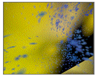
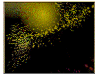
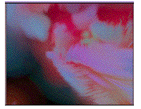
 nrs 1 & 2
Alexander Scriabin, Alexander Scriabin.Computer art combining music and visual arts
nrs 1 & 2
A short introduction by Kees Kaldenbach
Was Skrjabin one of those rare 'syn-esthetic' people whose minds generated associative images when hearing music? I do not know fur sure - but on the score of his 1911 symphony Prometheus, poem of fire, opus 60, he noted many visual characteristics alongside the music notation. This symphony with its additional remarks on visualisation was given a first continuous visual image track for television screening in 1998. This ground breaking programme, a N.P.S. (Dutch Television) production by visual artist Pieter Struycken was aired in Holland in 1998 (?). Technical assistance was provided by mr. D.Dekkers, a computer electronics engineer.
Peter Struycken considers Prometheus his most advanced computer generated work of art to date. Based upon this production experience he has subsequently created another software 'machine' which generates half an hour's programme of new images every day.
The Prometheus production may be well compared with its visual grandparent Fantasia, Walt Disney's 1940 production which also coupled classical music with a fiery glow of tumbling and cascading abstract images.
The nine images below are all stills from Prometheus. All pictures and the text below are copyright by Peter Struycken.
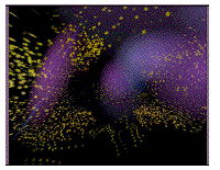
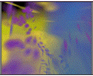
 nrs
3 & 4
nrs
3 & 4
Starting point for the design of colourspace by visual artist Peter Strucken were the two independent 'voices'in Skrjabin's score of Prometheus. In the score, Skrjabin points out which colours should appear or disappear and at what moment this shuld occur. He also constructed two 'colour-voices'.
Skrjabin, according to biographer Faubion Bowers, is explicit about a counterpoint-based (contrasting) effect of light changes. Although initially searching for an enhancement of sound through coloured lights, Skrjabin does not associate the colours with musical themes, timbre, or key in his score.
Rather, it seems that a common mystical goal is the binding element between sound and colour, thereby strenghtening the impact of the complete work. Skrjabin gives handwritten clues in his score that are very associative and symbolic in terms of mood and atmosphere. He uses the effect of light when he writes: 'mysterious', 'glowing', 'reflecting', 'fiery', but also psychological references: 'the dawning of human consciousness', 'joy of life', 'sorrow', and 'extatic pleasure'. Skrjabin assigns to art the all surpassing power, leading to purifucation and extasy. The effect of art in his opinion has truly cosmic proportions.
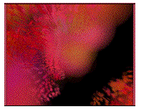
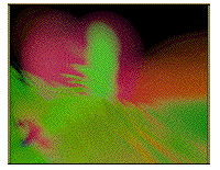
 nrs 5 & 6
With Skrjabin's instructions in mind, Struycken understands it is his task to develop a dynamic colourspace of his own, that visually complements the music, doing justice to the artistic independence that Skrjabin imagines when musical and visual arts are to be combined. That artistic space in itself is also necessary. For there is no fixed recipy available for the translation of sound to image or vice versa. Attempts from the past to find a systems and rules for this connection has never led to results that others could use in a satisfactory way.
Therefore, every time again, events in one medium have to be weighed for their inspiration and meaning for the other medium. The continuous change in tempo, direction and timbre which is so apparent in Prometheus, combined with Skrjabin's indications for change of colour form the most important connection for Struycken, for the movements of his colour space. Skrjabin does not prescribe the actual form, scale or movement in which the colours should appear, thus making its representation a decision made by the visual artist.
Like the music - the colourspace consists of two voices. The first voice changes from time to time and is represented by large, diffuse disc-shaped, slowly moving colours. The second voice often changes its colour and is made up of small, lively colour disks. The twelve musical keynotes of the 'mystical chords' (also known as Prometheus chords) are visually reproduced and connedted by twelve colours chosen by Skrjabin. Above the key notes are short, rapid variations in melody, rhythm and high notes of chords. In colour, they are manifested as eruptions, currents and clouds of small colour particles.
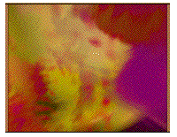
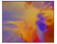 nrs 7 & 8
Not much is known about the background of Skrjabin's choice of colour. At the end of the 19th century, composers and visual artists showed a lively interest in the relations between sound and colour. in 1863, the physicist Von Helmholz had published his findings on the wave character of both light and sound. [Note his predecessor Christiaan Huygens in the 17th century!] Hence it became a tradition to combine the spectral succession of colours with the successive notes within the octave. Skrjabin uses this principle but not in the common synchrone succession of notes within the octave. He combines the spectral succession of colours within the notes in the 'circle of quints' that are spaced within an equal distance of each other. Skrjabin adds colours as well, since he uses twelve colours in stead of the usual seven or eight.
It is striking that Skrjabin uses three different colours of blue, one of which is a light one which he places between green and blue. It could well be that during his very primitive light-colour experiments, he has seen this colour as a mixed colour of green and blue light. It is also possible that he found it in scientific literature, just like red-violet is a mixture of red and blue? Then wehave still left the 'gloss of steel' that could symbolically reflect optimism about trhe rise of technology and industrialisation.
Subsequently however, he chooses a lead-grey colour as 'clour of light'. With the 'gloss of steel' opposite to the 'lead grey' we could interpret it as the the 'shining' that fits with 'dark', the primordeal colours of light, playing a part in many theories of colour too. Although it is not known that his colours have direct symbolic references, this is plausible because of his esoteric interests. In that world vieww colours are connected to mental conditions, such as bright blue for 'pure religious feelings' or dart red for 'greed, self love and anger'. (Charles W. Leadbeater, Man Visible and Invisible, 1902).[Compare this influence via Anne Besant and Madame Blavatsky in the early works by Mondrian]
 nr. 9
nr. 9
Struycken's colour space is based on the musical composition. It is a dynamically moving 'cosmos' that knows no boundaries in space or time. The music and visual fragments are merely a moment in that colour space. All light-coloured light-particles move independently from their change in colour and rotation. The movement of the light particles in the three demensions of space is a function of the continuous varying intensities of red, green and blue, which which are the ingredient colours of all light beams mixed by computer calculation.
Struycken has developed colour spaces since the nineteen eighties, every time with different characteristics. Sometimes he uses colour spaces to make static, two-dimensional cross sections as a basis for photo's, drawings or paintings. Sometimes they serve as a specification through colour of three-dimensional spaces in architecture. Sometimes he uses them dynamically and records the changes on film or video, or he computes 'real-time' images that can be watched as changing colours of light, directly on a monitor, or via projection om a screen.
For the Skrjabin project he uses for the first time a perspective reproduction of changes in a colour space. This new step requires a great deal of expertise in technology of 'computer graphics'. It necessitates closely following the changes in colour in the score in order to realize the colour space possible for television. This software development and programming of the colour space for Skrjabin's Prometheus was executed by computer scientist engineer D. Dekkers.
Image & text copyright by Peter Struycken.
See the experimental design phases by Struycken with various portraits of the queen on a separate page!
Computers & Design: See V2 Institute for instable media.
See also High School of Arts & Design, Utrecht.
Heimat far another combination of art & technology.
More on Struycken op internet:
http://www.art-public.com/artiste/AXXXX193.HTM
http://www.vpro.nl/data/aubette/struycken.html
http://www.boijmans.rotterdam.nl/onderw/biogr/struyck.htm
http://www2.netcetera.nl/~iaaa/rs/natuuren.html
On Struycken & Scriabin
http://www.hoise.com/CEC/LV-PR-12-98-3.html
http://www.omroep.nl/nps/tv/98/prometheus/english.html
More about the author Kaldenbach click author.
This page was first created on 16 September 2000 and updated 10 December 2001.